A library to provide fancy scroll effects such as parallax and animation.

Most of the widgets in this library are implemented as Slivers. This means they will work in
infinite scroll contexts and alongside other fancy scrolling widgets such as Fluter's
SliverAppBar. All you have to do is put them into a CustomScrollView and that will work!
Widget build(BuildContext context) {
  return CustomScrollView(
    slivers: <Widget>[
      // Any scroll_animate widgets that start with `Sliver` here!
      SliverEntranceAnimation(...),
      SliverSuspendedAnimation(...),
    ],
  );
}
These can be mixed with any other slivers, such as the core Flutter slivers.
    slivers: <Widget>[
      // Any core flutter slivers such as a SliverAppBar
      SliverAppBar(...),
      SliverPadding(...),

      // Normal lists & grids. Note, these do NOT currently support
      // animating their children, due to API limitations.
      SliverList(...),
      SliverGrid(...)

      // Don't forget SliverToBoxAdapter, which allows you to put
      // regular (non-sliver) widgets in the scrollview too!
      SliverToBoxAdapter(
        child: ... // any regular, non-sliver flutter widget
      ),
],Note: If your goal is to simply animate a widget on enter / exit, see
SliverEntranceAnimation.
Provide callbacks to perform when a widget enters or exits the scroll view.
By default, it will fire callbacks whenever any part of the widget becomes
visible, or the entire widget is offscreen. To change this behavior, use a
different EntrancePolicy.
SliverEnterExitCallback(
  onEnter: () { ... },
  onExit: () { ... },
  child: Container(...),
)
The child widget must be a normal box widget. To use this on another sliver, use
SliverEnterExitCallbackWrapper.
A version of SliverEnterExitCallback which accepts a Sliver as a child.
SliverEnterExitCallbackWrapper(
  onEnter: () { ... },
  onExit: () { ... },
  child: SliverList(...),
)
Perform an animation when a sliver enters/exits the scrollview. All you need to
do is specify a type parameter (for instance, double for animating opacity, or
Color for animating colors), a tween for the animation, and a builder to
build your widget with the current animation value.
By default, it will begin animations whenever any part of the widget becomes
visible, or the entire widget is offscreen. To change this behavior, use a
different EntrancePolicy.
// Provide a type argument for what you're animating.
SliverEntranceAnimation<double>(
  duration: const Duration(seconds: 1),
  curve: Curves.ease, // Optional

  // Provide a builder function for the current animation value.
  builder: (BuildContext context, double opacity, Widget? _) {
    return Opacity(
      opacity: opacity,
      child: ...,
    );
  },

  // Provide a Tween for the animation value range
  tween: Tween(
    begin: 0.0, // Transparent before scrolled into view
    end: 1.0, // Opaque after scrolled into view
  ),

  // Optional: provide an EntrancePolicy
  entrancePolicy: EntrancePolicy.completelyVisible(),
)
For performance reasons, you may specify a child widget which is not rebuilt
on animation. This is then passed into the builder callback.
To wrap another sliver (instead of a non-sliver Box widget) with an entrance
animation, provide a sliverBuilder callback instead of a builder callback.
If you wish to provide your own AnimationController, see
SliverEntranceAnimationBuilder.
If you wish to perform arbitrary behavior on enter / exit, see
SliverEnterExitCallback.
A lighter weight version of SliverEntranceAnimation, which takes an existing
AnimationController rather than managing its own. For most cases, you probably
want to use 'SliverEntranceAnimation`.
Drives the inner AnimationController with .forward() and .reverse() when
the contents are scrolled into and out of view. By default, it will begin
animations whenever any part of the widget becomes visible, or the entire widget
is offscreen. To change this behavior, use a different EntrancePolicy.
Rebuilds the child widget via the builder function when notified of a change
by the AnimationController.
class MyState extends State<MyWidget> {
  AnimationController controller;

  ...

  Widget build() {
    return CustomScrollView(
      slivers: <Widget>[
        SliverEntranceAnimationBuilder(
          controller: controller,
          builder: (context, _) {
            return Opacity(
              opacity: controller.value,
              child: ...
            );
          },
        ),
      ],
    );
  }
}
For performance reasons, you may specify a child widget which is not rebuilt
on animation. This is then passed into the builder callback.
A sliver that suspends in place and begins an animation when it reaches the top of a scroll view, and then continues to scroll when the animation is complete.

Can be an especially nice effect when the widget is set to match the size of
the screen, creating a sort of PageView effect, with feedback between
"pages."
The type parameter T refers to the type of the value that is being
animated. For instance, to animate opacity you would construct a
SliverSuspendedAnimation<double>.
The value will be animated through a range based on the provided tween, and as the value changes, the [builder] function will be invoked with the current value to create the widget that is rendered.
The duration of the suspension is specified in pixels the user will have to scroll before it becomes revitalized and scrolls again.
// Provide a type argument for what you're animating.
SliverSuspendedAnimation<Color?>(
  duration: 200.0, // specified in pixels of scroll
  curve: Curves.ease, // Optional

  // Provide a builder function for the current animation value.
  builder: (BuildContext context, double opacity) {
    return Opacity(
      opacity: opacity,
      child: Container(...),
    );
  },

  // Provide a Tween for the animation value range
  tween: ColorTween(
    begin: Colors.red, // Red before scrolled to top
    end: Colors.blue, // Animates to blue before scrolling again
  ),
)A sliver which suspends in place once it is scrolled to the top of the page. It will stay suspended in the top of the scroll view until the user has continued to scroll a specified amount.

This can be a useful effect, especially when the child is the size of the
screen, creating an effect similar to a PageView. This is usually best done
with a SliverSuspendedAnimation.
SliverSuspend(
  duration: 200.0, // specified in pixels of scroll
  child: Container(...)
)A sliver that suspends in place and then resizes when scrolled to the top of screen, before continuing to scroll.

The size transition is defined by the mainAxisExtentTween, which determines
the size of the widget in the scrolling axis direction.
The child widget will be put in a SizedBox which changes size during scroll.
Remember that with the right [Curve] and/or [Tween] it is possible to create some highly dynamic effects, for instance, [TweenSequence].
The duration of the suspension is specified in pixels the user will have to scroll before it becomes revitalized and scrolls again.
SliverSuspendedResize(
  duration: 200.0, // specified in pixels of scroll
  curve: Curves.ease, // Optional

  child: Container(...),

  // Provide a Tween for the size transition
  tween: Tween(
    begin: 200.0, // Height before scrolled to top
    end: 100.0, // Then will shrink to this height before resuming scroll
  ),
)A sliver that suspends in place at the top of the scrollview and crossfades between two widgets before continuing to scroll.

The minimum necessary to use this widget is to provide two children; the [first] and [second], and a duration. However, there may be issues sizing the children, and for this reason there are a variety of sizing parameters available as well.
The duration of the fade is specified in pixels the user will have to scroll before it completes and scrolls again.
SliverSuspendedFadeTransition(
  duration: 200.0, // specified in pixels of scroll
  curve: Curves.ease, // Optional

  first: Text("This shows up first"),
  second: Text("This fades in instead at the top of the scroll."),
)A sliver that suspends in place at the top of the scrollview and performs a swipe/slide type transition between two widgets before continuing to scroll.

The minimum necessary to use this widget is to provide two children; the [first] and [second], and a duration. However, there may be issues sizing the children, and for this reason there are a variety of sizing parameters available as well.
The duration of the slide is specified in pixels the user will have to scroll before it becomes revitalized and scrolls again.
SliverSuspendedSlideTransition(
  duration: 200.0, // specified in pixels of scroll
  curve: Curves.ease, // Optional

  first: Text("This shows up first"),
  second: Text("This swipes in at the top of the scroll."),
)Makes a widget scrolls faster or slower than other scroll contents, creating a "parallax" effect. Often used to imitate 3D/depth, but also can be used to create a visual surprise when contents unexpectedly line up in interesting ways while scrolling.

For background parallax effects, and/or for parallax usage where size and scroll
speed are logically coupled, see SliverFittedParallax.
Simply provide a child for the widget that will move at a parallax, and a
mainAxisFactor that changes the scroll rate.
To reduce this widget's scroll rate, provide a mainAxisFactor less than
1.0. To make it scroll faster, provide a factor greater than 1.0 or make it
scroll the opposite direction with a negative factor. You can also give a
crossAxisFactor to make it move perpendicular to the scroll direction.
By default, the child paints at (0, 0) when the next sliver in the scrollview
is scrolled to the top of the view. This is the "neutral" position of this
[SliverParallax] and can be adjusted in two ways.
To change the amount of scrolling required to hit "neutral" position, see
ParallaxScrollCenter. You can provide a custom relative or absolute offset.
To change where on the screen this widget is painted at the neutral scroll
amount, you can provide your own Offset.
SliverParallax(
  // provide a mainAxisFactor and/or a crossAxisFactor
  mainAxisFactor: 0.8,

  // provide a child
  child: Text("Hovering, slower scrolling text"),

  // optionally provide an offset
  offset: Offset(0, MediaQuery.of(context).size.width / 2),

  // and optionally change the scroll center
  center: ParallaxScrollCenter.relativePx(-200),
),Very useful for parallax style backgrounds. Like SliverParallax, makes a
widget scrolls faster or slower than other scroll contents, creating a
"parallax" effect. However, a FittedParallax will either fits its scroll speed
to its child's size, or fit its child's size to its scroll.
Intended for a parallax child which is larger than its scroll container and should always be visible within a certain scroll range (typically, from the beginning to end of the scroll view). This widget will constrain the child size OR set the scroll speed such that the edges of this widget are not visible when the user is scrolling through that range.
When mainAxisFactor is not null, the child widget's size in the main scroll
axis (ie, height in a vertical scroll) will be constrained so that the widget is
still in view when scrolled to within the range. If mainAxisFactor is null,
then a mainAxisFactor will be chosen that maintains this property instead. It
will do the same for crossAxisFactor and the scroll axis size (ie, width in a
vertical scroll).
Rather than using a [ParallaxScrollCenter] to determine a "neutral" position,
this takes a start and end scroll offset. These default to an absolute 0px
start and a relative 0px end -- this means if it is the last sliver in the
scroll view it will function as a background for the whole scroll view.
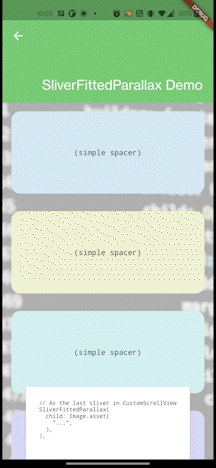
CustomScrollView(
  slivers: <Widget>[
    // *ALL* other slivers go *FIRST*.
    ...

    // For a scroll rate inferred from the image size
    SliverFittedParallax(
      child: Image.asset(...),
    ),

    // OR

    // For an exact scroll rate, sizing the image accordingly.
    SliverFittedParallax(
      mainAxisFactor: 0.3,
      child: Image.asset(
        ...,
        fit: BoxFit.cover,
      ),
    ),
  ],
)
Note: This widget is not a Sliver. To use it as a sliver, wrap it in a
SliverToBoxAdapter.
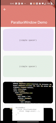
A ParallaxWindow is a widget that can create the appearance of a window into a
background view, which then moves during scroll, creating a parallax effect.
Provide a child widget, and note that it will be layouted without constraints,
in order to let it layout at its "natural" size. This is useful for Image()
widgets, but others may need to be wrapeed in a SizedBox etc. Usually, the
child widget should be larger than this widget's parent. Then the child widget
will be only partially painted, in order to fit inside the window.
The offset of how the child widget is painted to fit will change over time as
the user scrolls. By default, ParallaxWindow shows bottomCenter as the
widget is scrolled into view, and that animates to topCenter as the widget is
scrolled the rest of the way. You can customize this by providing a custom
Alignment tween, controlling which part shows at the end of scroll vs the
beginning of scroll.
ListView(
  children: <Widget>[
    ...
    SizedBox(
      // Size the ParallaxWindow, or embed it within any layout
      height: 150,
      child: ParallaxWindow(
        // Use an image or other oversized background.
        child: Image(...),

        // optionally change the alignment transition:
        alignmentTween: AlignmentTween(
          // used at the bottom of the scroll
          begin: Alignment.topLeft,
          // used at the top of the scroll
          end: Alignment.bottomCenter,
        ),
      ),
    ),
    ...
  ],
)
You can also get a unique effect by specifying a custom Curve, which changes
how scroll progress is used to interpolate alignment progress.
You can also customize the scroll range in which the parallax effect occurs by
providing a custom ScrollRange. See ScrollRange for more, but note that this
may not work the way you expect when used in a ParallaxWindow, and that
usually the default of a FullScrollRange is desired.
Note: This widget is not a Sliver. To use it as a sliver, wrap it in a
SliverToBoxAdapter.
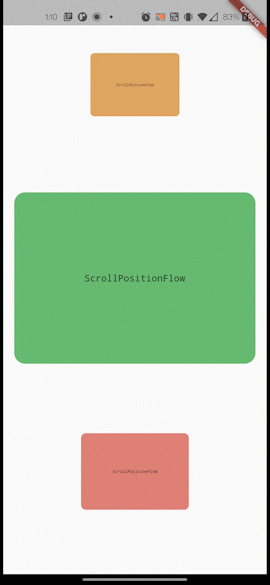
Animate a widget based on its scroll progress/position within the scroll view,
with paint operation changes only. This is a more performant but more limited
version of SliverPositionAnimation.
Much like the core flutter Flow widget, this will only let you animate matrix
transforms and opacity of the child widget. This allows flutter to skip the
layout stage of render for this subtree even as it animates.
This widget can be used with the default constructor to perform completely customizable behavior, however, usually one of the factory constructors will be easier to use and do what you want.
The next most basic factory constructor is ScrollPositionFlow.animate, which
takes a Tween for a matrix transform animation and an opacity animation. The
scroll progress will be used (along with an optional Curve) to get get the
current animation value for every frame.
ListView(
  children: <Widget>[
    ...
    ScrollPositionFlow.animate(
      opacity: Tween(begin: 0.0, end: 1.0),
      child: ...
    ),
    ...
  ],
)
Transformation matrices are very powerful, but complex to use. For this reason,
the factory constructors ScrollPositionFlow.animateScale and
ScrollPositionFlow.animateTranslate are provided that can build these types of
matrices for you.
ListView(
  children: <Widget>[
    ...
    // scale the widget up as it scrolls
    ScrollPositionFlow.animateScale(
      scale: Tween(begin: 0.0, end: 1.0),
      child: ...
    ),

    // slide the the widget in from the left as it scrolls
    ScrollPositionFlow.animateTranslate(
      translate: OffsetTween(
        begin: Offset(-MediaQuery.of(context).size.width, 0),
        end: Offset(0, 0),
      ),
      child: ...
    ),
    ...
  ],
)
All constructors also take an Alignment to determine the center point of
the transformation. This defaults to the center of the child. You can also
provide a custom Clip behavior (by default it will not clip).
By default, when the widget has barely appeared on screen the animation is
started at 0% progress, and reaches 100% progress when it is fully scrolled off
the top of the scroll view. To customize this behavior, provide a ScrollRange.
Different ScrollRanges can change the top to 100% and the bottom to 0%, or
they can make part of the middle 100% while the top and bottom are 0%, and they
can change what's considered the top and bottom. There are existing
ScrollRanges defined and they have methods to tweak them, or you can write
your own from scratch. See ScrollRange for more.
ListView(
  children: <Widget>[
    ...
    // scale the widget up as it scrolls
    ScrollPositionFlow.animateScale(
      scale: Tween(begin: 0.0, end: 1.0),
      scrollRange: ScrollRange.centerVisibleRange().distanceFrom(0.4, 0.6),
      child: ...
    ),
Note: the transformations do not effect the layout of this component and do
not affect how the ScrollRange progress is calculated. That would result in a
circular dependency to calculate progress.
Defines when a SliverParallax hits center in the scrollview.
A SliverParallax has a "neutral" position which defaults to (0, 0) but is
configurable via it's offset. As the user scrolls, the SliverParallax either
faster or slower than the rest of the scrollview, (and perhaps in the cross axis
direction). The SliverParallax will hit the "neutral" position at some scroll
amount. This class defines that scroll amount.
For convenience in designing parallax UIs, a relative offset is allowed, which is based on the scroll position the sliver would have if it were not a special parallax effect.
However, an absolute offset is also allowed. This is especially useful as a means of setting a background at scroll position 0, since slivers are painted in reverse order. If the last sliver has a scroll center of 0 then it will be painted below all others but still aligned with the top of the scroll.
ParallaxScrollCenter.relativePx(100),
// or
ParallaxScrollCenter.absolutePx(100),Used to determine sliver visibility, in order to determine when to animate a
SliverEntranceAnimation, or when to fire the callbacks of a
SliverEnterExitCallback. An interface may wish, for instance, to begin an
animation when the widget is partially visible, fully visible, or something else
entirely.
There are also a few reasonable preset behaviors you can use:
EntrancePolicy.anythingVisible(): Any part of the sliver is visible.EntrancePolicy.completelyVisible(): All of the sliver is visible.EntrancePolicy.topEdgeVisible(): The top of the sliver is visible.EntrancePolicy.bottomEdgeVisible(): The bottom of the sliver is visible.EntrancePolicy.scrolledBeyondBottomEdge(): The scroll view includes, or has scrolled past, the bottom of this sliver. This intentionally considers the sliver visible while the user has scrolled past it; in a [SliverEntranceAnimation] this means the animation does not occur when the user scrolls back up to this sliver, only when they scroll down to it.EntrancePolicy.scrolledBeyondTopEdge(): The scroll view includes, or has scrolled past, the top of this sliver. This intentionally considers the sliver visible while the user has scrolled past it; in a [SliverEntranceAnimation] this means the animation does not occur when the user scrolls back up to this sliver, only when they scroll down to it.
If these behaviors don't do what you wante, you can write your own behavior by
analyzing the SliverConstraints and SliverGeometry of the sliver:
class MyEntrancePolicy implements EntrancePolicy {
  bool visible(SliverConstraints constraints, SliverGeometry geometry) {
    return ...
  }
}The ScrollRange class defines the range used to determine progress in a scroll
progress widget, such as SliverPositionAnimation, ScrollPositionFlow, or
ParallaxWindow.
ListView(
  children: <Widget>[
    ...
    ScrollPositionFlow.animateScale(
      scrollRange: ScrollRange.centerVisibleRange().distanceFrom(0.4, 0.6),
      scaleTween: Tween(begin: 0.0, end: 1.0),
      child: RoundedBox(...)
    ),
    ...
  ],
)
By using your own ScrollRange, you can change whether these animations begin
or end before the widget is fully scrolled on screen, tune them via custom
offsets and padding, or even set the animation to reach 100% effect in the
middle and reverse the animation as the widget is scrolled out of view.
The default implementations are available via factory constructors:
ScrollRange.fullRange: Use this to animate from the moment the widget appears at the bottom to the moment it disappears at the top.ScrollRange.fullyVisibleRange: Use this to animate from the moment the widget is fully visible at the bottom to the moment it is fully visible at the top.ScrollRange.topVisibleRange: Use this to animate from the moment the top of the widget is visible at the bottom of the page to the moment the top of the widget passes the top of the scroll view.ScrollRange.centerVisibleRange: Use this to animate from the moment the center of the widget is visible at the bottom of the page to the moment the center of the widget passes the top of the scroll view.ScrollRange.bottomVisibleRange: Use this to animate from the moment the bottom of the widget is visible at the bottom of the page to the moment the bottom of widget passes the top of the scroll view.
To set the middle of a range to be 100% progress, first use one of the above
constructors, and then call distanceFrom(lowerBound, upperBound) to create a
new range. The new range's progress will go from 0% at the bottom of the range,
to 100% at lowerBound, stay at 100% until upperBound, and then go to 0% at
the top. lowerBound and upperBound should be between 0.0 and 1.0.
This class also has methods other to refine a scroll range. See .inverse,
.subrange(lowerBound, upperBound), .offset(pixels),
.withScrollPadding(top: pixels, bottom: pixels), and
withChildMargin(top: pixels, bottom: pixels).
You can use one of these implementations and methods to create your scroll
range, or you can create your own entirely custom behavior by extending this
class and overriding the behavior of the progress() method.