Fading effects for UIButtons made simple
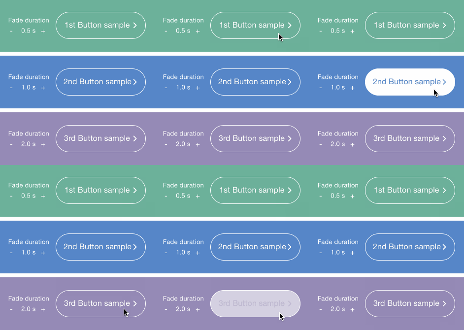
This is just a customizable UIButton subclass that provides fading effects that display upon touch:
Effects occur when the user releases the button.
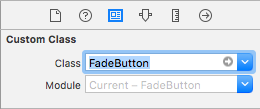
1) Go to interface builder, select your button, open the Identity Inspector tab, and set FadeButton as custom class.
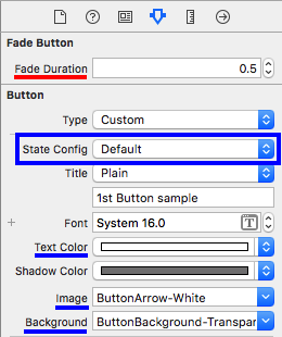
2) Check out the following attributes in the Attributes Inspector tab:
fadeDurationconfigures how long the fading effect will last.- Then, the properties
textColor,imageandbackgroundImage(that can have different values set for each state config) will be affected by the fading effect when the transitions between the.highlightedstate and the.normalstate occur.- For instance, if you set
textColor: .white for: .normalstate andtextColor: .yellow for: .highlightedstate, the user will see a fading text effect from yellow to white after releasing the button.
- For instance, if you set
There's a sample project inside this repo that you can check out in order to have a deeper understanding of the usage of this library.
- Via cocoapods, add this line to your
Podfile:pod 'FadeButton', '~> 2.0'
- Otherwise, you can just drag and drop the
FadeButton.swiftfile into your project, and keep it up to date by yourself.
- As of its 2.0.0 release, this library works with Swift 3.0
- If you look for older languages version support, you can check out the 1.0.0 release, that contains the old Objective-C version of the library, which is compatible with older Swift versions.
For questions or general comments regarding the use of this library, please use our public hipchat room.
If you find any bug, a problem while using this library, or have suggestions that can make it better, please open an issue in this repo (or a pull request).
You can also check all of our open-source projects at inaka.github.io.


