-
Notifications
You must be signed in to change notification settings - Fork 0
Home
Visual analytics of greenhouse emissions.

This project was created as part of the interview process at Blue Sky Analytics
Greenhouse gas emissions have been increasing significantly. This project can be used to analyze how the countries have been polluting the air in the last couple of years.
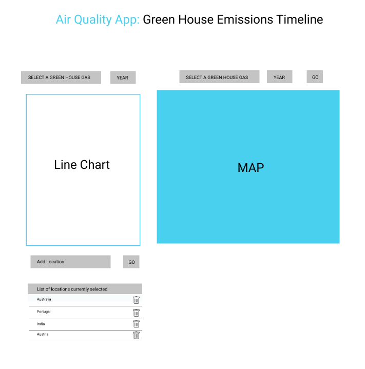
This project has 2 data visualization tools : a line chart and a map. Line chart can be used to analyse the emission (in kilotons) vs year. And the map colors all the countries according to their emissions in a particular year.
clone repo and install using -
npm install
npm run start
npm run build
This project uses React JS to visualize historical data. The following image explains the UI design:

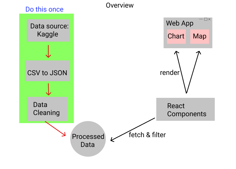
Historical data of greenhouse emissions was downloaded from Kaggle. Then its preprocessing was done. This included cleaning the data, renaming headers, etc. The following image explains the complete overview of the project:

This project has 2 main parts:
- Data cleaning
- Data visualization ( Part 1 & Part 2 )