ggtwotone: two tone lines and annotations in ggplot2
Using color in visualizations is tricky. Even while leaving the ‘best’ color choices to artists, the advice on using colors in data visualizations ranges from avoidance to not doing any harm.
We want to address one specific problem in choosing colors: making annotations on charts more visible. The table below shows three strategies for using a pullout for annotating an element in a plot. The focus is on the line connecting the textual annotation to the plot element. Choosing a color for the connecting line that is visible on a dark and light background is… difficult. As we see in the table, the light line (left image) disappears over the light background, while the darker line (right image) disappears on the darker background. So which color was used to prevent the line from not disappearing in the middle image? The line is actually made up of two separate line segments in two different colors.
 |
 |
 |
| light grey line | dark grey line |
 |
Colors are extremely context-sensitive, i.e., how we perceive a color is affected by its physical and conceptual context. The colors around a given color define the physical context of the color. Our understanding of ‘the bigger picture’ creates the conceptual context.
The colors in the marked tiles of the images in the table below are identical. The image on the left is an example where the colors around it change our perception of a color. The tile on the left is in an area where most of the other tiles are a darker shade of red, whereas the surrounding tiles on the right are a lighter shade of red than the marked tile. This tricks our perception, and for (most of) us, the tile on the left appears lighter than the tile on the right. In the image on the right, the conceptual context is that of a checkerboard, i.e., we expect to see dark and light tiles. The tile marked A is one of the dark checkered tiles, while B is one of the lighter tiles. Additionally, the green cylinder throws its shadow over the board. In its entirety, this masks the fact that the colors in tiles A and B are identical.
 |
 |
| Physcial context: the two shades of red at the end point of the lines are identical. | Conceptual context: the colors in the tiles marked A and B are identical: checker shadow color illusion (Adelson 1995) |
Colors themselves are multivariate objects, i.e. each color is made up
from different, sometimes related pieces that together create a color.
There is a large number of models used to describe colors - one of the
most familiar ones is the RGB model, which describes a color as a
triplet of values between 0 and 255, describing the contributions of
red, green, and blue to a color C, where black is denoted as (0,0,0),
and white as (255,255,255). Because
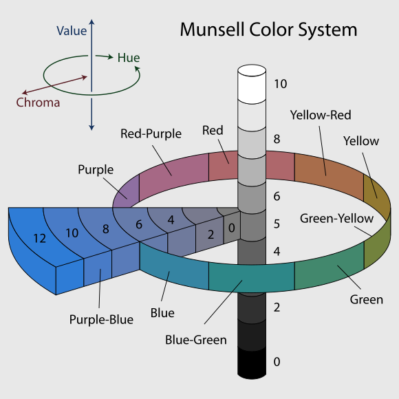
Perceptually, the RGB model is not well suited, because we do not perceive colors as part red, green, and blue. A perceptually very useful model is the Munsell color space. Albert Munsell was a painter, and the color space is heavily influenced by a painter’s approach: this space describes a color by its hue on a color wheel (with colors ordered by their wavelength), the amount of color (or chroma) mixed into a base of grey (the ‘value’, a gradient of grey shades between black and white). While keeping similar parameterizations, the HCL color space has by now replaced Munsell colorspace. HCL is a perceptually uniform color space, ie. we differences between colors can be expressed as a distance. Colors that are the same distance apart are perceived as similarly different.
 |
 |
| Munsell color space, image © 2007, Jacob Rus | HCL or L * C * h(uv) |
Perceptually uniform color spaces allow us to address some questions of perception and visibility of colors in a quantitative manner. The contrast between two colors largely determines whether we see two different colors. Color contrast is defined by the W3C (World Wide Web Consortium) as the ratio of the relative luminances of two colors. In WCAG (Web Content Accessibility Guidelines (WCAG)) 2.0 minimal thresholds of this ratio are used to determine readability of text on background for different color combinations. Since these guidelines were published in 2008, research into color has not stopped, and in particular, the idea of contrasts between colors depending solely on their luminance should be discarded, see e.g. Lisa Charlotte Muth’s blog post. Most likely the WCAG 3.0 standard will contain some form of an updated color contrast algorithm, such as the APCA (Advanced Perceptual Contrast Algorithm).
Taking all of these different color aspects together, they provide a good basis of why a two-tone approach for lines will help with visibility:
- Using a light and a dark shade of the same hue in side-by-side lines makes the visibility of the line less dependent on the background: in dark areas, the lighter shaded line has a higher contrast, while in light backgrounds the darker line raises the contrast.
- If the overall line width is thin, the two tones in the line will likely stay below the detection threshold by a viewer, but won’t likely add to any confusion when detected.
Rather than manually drawing suitable lines for each annotation, we seek
an implementation that directly extends the ggplot2 plotting environment.
Annotations in charts are a powerful way of directly label or empahisize
aspects of a chart. Tools for annotations exist in various forms.
Annotations themselves are visual in nature, which means that any
visualization system either offers functionality for annotations or can
be used to for annotating elements, i.e. the ggplot2 package provides
the function annotate, but we can make use of the layering system to
implement whole data sets of annotations.
We are not aware of any package in R that would address visibility of
annotations based on color modifications. The maybe most closely related
R package is ggshadow. This package
implements layers of glow lines and shadows of lines. We have
investigated this package for use in the scenario described above and
found that there was not enough control over the line widths available
to ensure an equal side-by-side of the two color tones. The package
ggrepel addresses
poor readability of overlapping annotations by providing modified
positioning.
This project touches (very gently) on accessibility of charts in R.
Recent developments in this respect include the package BrailleR for automatic descriptions of
plot content and the package sonify
for turning data into sound.
The goal of this project is to create an R package extending ggplot2
functionality by implementing a seamlessly integrated geom for a
two-tone colored line.
What you will need to bring: good R coding skills, good knowledge of the
ggplot2 framework, and the interest to look deeper under the hood of
ggplot2 and the grid package.
Mentors, please explain how this project will produce a useful package for the R community.
Contributors, please contact mentors below after completing at least one of the tests below.
- EVALUATING MENTOR: Haley Jeppson [email protected] is the author of
the R package
ggmosaic. - Heike Hofmann [email protected] is an expert in data
visualization, author of the R packages
ggpcp,x3ptools,bulletxtrctr, among others, and has previous GSOC experience with the R organization in 2016, 2017, and 2019.
Contributors, please do at least two of the following tests before contacting the mentors above.
Install the package colorspace implements functionality for
working with colors. The function colorspace::contrast_ratio provides
an assessment of the contrast ratio between two or more colors using
both the WCAG 2.0 standard and the newer APCA algorithm. Write a
function that
- (randomly) samples a set of colors,
- assesses for each element in the sample its contrast ratio (in either WCAG or APCA, make that a parameter of the function) to a light grey, such as “#eeeeee”, and a dark grey, such as “#111111”.
- then visualizes a color tile and writes both the hexcode of the color and the numeric value of the contrast ratio on top of the color tile. The labeling should be in the color that provides the greater contrast.
It might be a good idea to write separate helper functions.
Chapter 21 of Hadley Wickham’s book “ggplot2: Elegant Graphics for Data Analysis” describes how to extend ggplot2.
Write a geom called GeomSegmentDual that extends the regular ggplot2
GeomSegment. Implement the function draw_panel to allow for two calls
to segmentsGrob drawing two sets of lines side by side as shown below.
You will find the function convertHeight to be of importance. What
does the call
convertHeight(unit(.pt,"pt"), unitTo = "npc", valueOnly = TRUE) in
draw_panel return?
draw_panel <- function(self, data, panel_params, coord, arrow = NULL, arrow.fill = NULL,
                                             lineend = "butt", linejoin = "round", na.rm = FALSE) {
 ...

 s1 <- segmentsGrob( ...) # color segments in color 1
 s2 <- segmentsGrob( ...) # color segments in color 2

 return(gList(s1, s2))
}
Make sure to include a working example showcasing your function.
Wrap the two functions from the easy and the medium test into an R
package. Add documentation with some examples of use cases. Make sure
that your package passes R CMD check.
Contributors, please post a link to your test results here.
- EXAMPLE CONTRIBUTOR 1 NAME, LINK TO GITHUB PROFILE, LINK TO TEST RESULTS.
- Ioannis Valasakis, GitHub, Test (Easy & Medium)