It allows you to manage a series of forms or steps in a workflow, providing navigation functionality between stages, as well as the ability to define custom logic for each stage. Each stage can have its own component, and you can control navigation, validation, and data passing between stages.
<script setup lang="ts">
import { reactive } from "vue";
import { IStage } from '@multi-steps-wizard';
import { Personal, Contact, Employment, Loan } from "./stages";
import type { IUserLoanData } from "./app.ts";

const STAGES = {
  'LOAN_PERSONAL': 'loanPersonal',
  'LOAN_CONTACTS': 'loanContacts',
  'LOAN_EMPLOYMENT': 'loanEmployment',
  'LOAN_DETAILS': 'loanDetails',
} as const;

const entrypointComponent = STAGES.LOAN_PERSONAL;

const userLoanData = reactive<IUserLoanData>({
  personal: { fullName: "", age: 0, dateOfBirth: "", skipNextStage: false },
  contacts: { email: "", phoneNumber: "", address: "" },
  employment: { employerName: "", jobTitle: "", annualIncome: "" },
  loanDetails: { loanAmount: "", loanPurpose: "", loanTerm: "" }
});

const stagesConfiguration: Record<typeof STAGES[keyof typeof STAGES], IStage<Partial<typeof userLoanData>>> = reactive(
  {
      [STAGES.LOAN_PERSONAL]: {
        stageOrderKey: 1,
        component: shallowRef(Personal),
        payload: {
          ...userLoanData.personal
        },
        excludeNextStageFromCache: true,
        title: 'Personal Information',
        nextStage: STAGES.LOAN_CONTACTS,
        prevStage: null,
        onNextPageClick: async (next: () => void, {personal}) => {
          userLoanData.personal = personal!
          // Maybe API call (personal)
          // Maybe failed errorMessages.value.push("Failed server validation for field...")
          stagesConfiguration[STAGES.LOAN_CONTACTS].isInvisible = Boolean(personal?.skipNextStage)
          stagesConfiguration[STAGES.LOAN_CONTACTS].skip = Boolean(personal?.skipNextStage)
          next()
        }
      },
      [STAGES.LOAN_CONTACTS]: {
        stageOrderKey: 2,
        title: 'Contact Details',
        component: shallowRef(Contact),
        payload: {
          ...userLoanData.contacts
        },
        isInvisible: false,
        skip: false,
        nextStage: STAGES.LOAN_EMPLOYMENT,
        prevStage: STAGES.LOAN_PERSONAL,
        onNextPageClick: (next: () => void, {contacts}) => {
          userLoanData.contacts = contacts!
          next()
        }
      },
      [STAGES.LOAN_EMPLOYMENT]: {
        stageOrderKey: 3,
        title: 'Employment Information',
        component: shallowRef(Employment),
        payload: {
          ...userLoanData.employment
        },
        nextStage: STAGES.LOAN_DETAILS,
        prevStage: STAGES.LOAN_CONTACTS,
        onNextPageClick: (next: () => void, {employment}) => {
          userLoanData.employment = employment!
          next()
        }
      },
      [STAGES.LOAN_DETAILS]: {
        stageOrderKey: 4,
        title: 'Loan Details',
        component: shallowRef(Loan),
        payload: {
          ...userLoanData.loanDetails
        },
        nextStage: null,
        prevStage: STAGES.LOAN_EMPLOYMENT,
        onNextPageClick: (next: () => void, {loanDetails}) => {
          userLoanData.loanDetails = loanDetails!
          next()
        }
      }
    }
)
</script>

<template>
  <BaseMultiStages
    :stages="stagesConfiguration"
    :entrypoint-component="entrypointComponent"
  />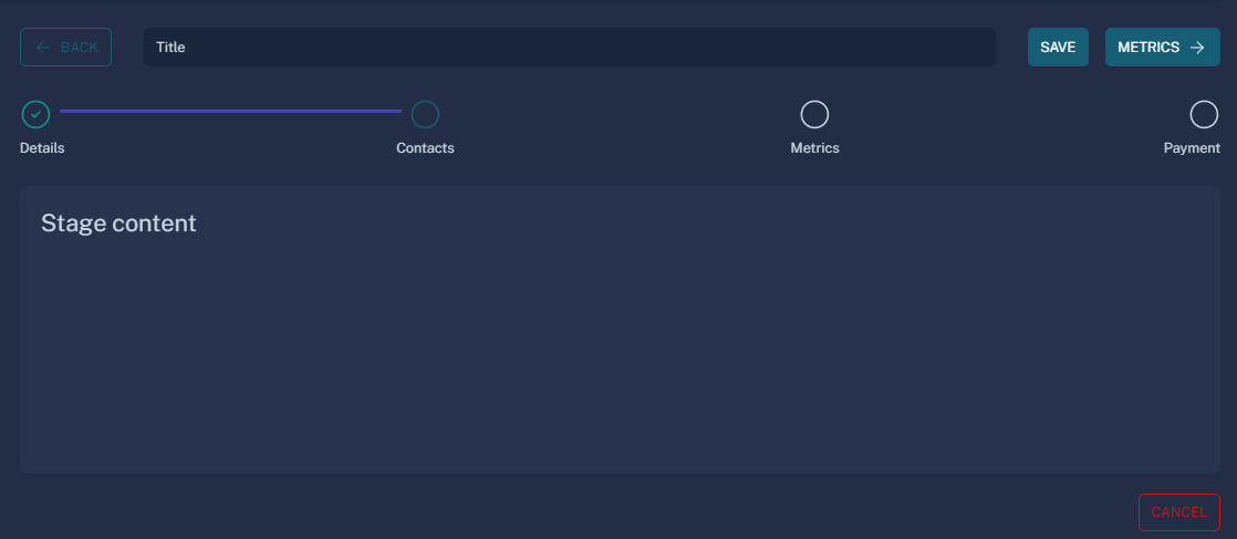
</template>The BaseMultiStages component provides a ready-to-go foundation for using a multi-stage wizard.
Its template is fully detached from the logic, allowing you to use the useWizard composable to define your own template structure.
interface IMultiStagesProviderProps<T extends object> {
/** Object with stages */
stages: Record<string, IStage<T>>
/** The component to start the wizard. */
entrypointComponent: string
/** Server side validation error messages */
errorMessages?: Array<string>
}

interface MultiStagesProviderEmits {
  (e: "stageChange", stage: keyof typeof props.stages): void
  /** Triggered when the "Save" button is clicked. Use this to handle save logic.. */
  (e: "saveClick", data: object): void
  /** Triggered when the "Cancel" button is clicked. Use this to handle cancellation logic. */
  (e: "cancelClick"): void
}export interface IStage<T extends object> {
/** The position of the stage in the wizard flow */
stageOrderKey: number;
/** The title displayed for the stage */
title: string;
/** The data related to the stage */
payload: object;
/** The Vue component rendered for this stage */
component: Component;
/** The key for the next stage in the flow */
nextStage: string | null;
/** The key for the previous stage in the flow */
prevStage: string | null;
/**
* Function that runs when the "Next" button is clicked.
* It can be asynchronous and receives stage data and the callback that navigate to the next stage.
*/
onNextPageClick?: (next: () => void, data: T & { [key: string]: unknown }) => Promise<unknown> | void;
/**
* Function that runs when the "Previous" button is clicked
*/
onPrevPageClick?: (prev: () => void, data: T & { [key: string]: unknown }) => Promise<unknown> | void;
/** Disables the "Previous" button if true. */
isPrevButtonDisabled?: boolean;
/** Disables the "Next" button if true. */
isNextButtonDisabled?: boolean;
/** If true, the stage will not be rendered. */
isInvisible?: boolean;
/** If true, the next stage is excluded from the cache. */
excludeNextStageFromCache?: boolean;
/** Determines whether the stage should be skipped (e.g., based on previous data or logic) */
skip?: boolean;
/** Tooltip text for the "Previous" button */
prevButtonTooltip?: string;
/** If true, this marks the stage with an error. */
hasError?: boolean;
}Note: You need to expose validate if you have one. Any other exposed fields will be treated as data.
<!-- export name for cache (<keep-alive />) -->
<script lang="ts">
export default {
  name: "loanPersonal"
}
</script>
<script setup lang="ts">
import {ref} from "vue";
import useVuelidate from "@vuelidate/core";
import {minValue, required} from "@vuelidate/validators";

interface DetailsProps {
  payload: {
    fullName: string,
    age: number,
    dateOfBirth: string,
    skipNextStage: boolean
  }
}

const props = withDefaults(defineProps<DetailsProps>(), {
  payload: () => ({
    fullName: "",
    age: 0,
    dateOfBirth: "",
    skipNextStage: false
  })
})

const state = ref({
  fullName: props.payload.fullName,
  age: props.payload.age,
  dateOfBirth: props.payload.dateOfBirth,
  skipNextStage: props.payload.skipNextStage,
})

const rules = {
  fullName: {required},
  age: {required, minValue: minValue(18)},
  dateOfBirth: {required},
}

const v$ = useVuelidate(rules, state)
const validate = v$.value.$validate

defineExpose({personal: state, validate})
</script>If you don't want to change properties imperatively, you can use a watcher to reactively update the stagesConfiguration whenever the underlying data changes.
let stagesConfiguration: ShallowRef<Record<typeof STAGES[keyof typeof STAGES], IStage<Partial<typeof userLoanData>>> | {}> = shallowRef({})
const updateStagesData = () => {
  stagesConfiguration.value = {
    [STAGES.LOAN_PERSONAL]: {
      ...
      onNextPageClick: async (next: () => void, {personal}) => {
        userLoanData.personal = personal!
        next()
      }
    },
    [STAGES.LOAN_CONTACTS]: {
      skip: userLoanData.personal.skipNextStage,
      isInvisible: userLoanData.personal.skipNextStage,
    },
    ...
    }
  }
}

watch(userLoanData, updateStagesData, {deep: true, immediate: true})If you decided to go with BaseMultiSteps component,
Alert is used to display errors and provide messages. The component provides a named slot alert that allows users to customize the entire alert display. If no custom slot is provided, the component will fall back to a default alert implementation.
type Variant =
  | "primary"
  | "secondary"
  | "success"
  | "warning"
  | "pending"
  | "danger"
  | "dark"
  | "outline-primary"
  | "outline-secondary"
  | "outline-success"
  | "outline-warning"
  | "outline-pending"
  | "outline-danger"
  | "outline-dark"
  | "soft-primary"
  | "soft-secondary"
  | "soft-success"
  | "soft-warning"
  | "soft-pending"
  | "soft-danger"
| "soft-dark"npm run devThis script starts the development server using Vite with the configuration specified in ./playground/vite.config.js. It allows you to test your application locally during development.
npm run buildThis script builds the production-ready application using Vite. The output files will be optimized for deployment.