Easy (and good looking) credit-card input for your React Native Project 💳 💳


Code:
<CreditCardInput onChange={this._onChange} />
// or
<LiteCreditCardInput onChange={this._onChange} />- Skeuomorphic credit-card 💳 (inspired by: card, react-native-credit-card)
- !!NEW!! Now you could scale the Credit Card for smaller screens
- !!NEW!! Now you could use CardView as a Component. example use case: showing saved payment details, etc.
- Lite version for smaller screens (or if skeuomorphic is not really your thing)
- Credit-card input validations & formatting while you're typing
- Form is fully navigatable using keypad
- Works on both Android and iOS
npm i --save react-native-credit-card-inputthen add these lines in your react-native codebase
import { CreditCardInput, LiteCreditCardInput } from "react-native-credit-card-input";

<CreditCardInput onChange={this._onChange} />
// or
<LiteCreditCardInput onChange={this._onChange} />

// Note: You'll need to enable LayoutAnimation on android to see LiteCreditCardInput's animations
// UIManager.setLayoutAnimationEnabledExperimental(true);
And then on your onChange handler:
_onChange => form => console.log(form);

// will print:
{
  valid: true, // will be true once all fields are "valid" (time to enable the submit button)
  values: { // will be in the sanitized and formatted form
  	number: "4242 4242",
  	expiry: "06/19",
  	cvc: "300",
  	type: "visa", // will be one of [null, "visa", "master-card", "american-express", "diners-club", "discover", "jcb", "unionpay", "maestro"]
  	name: "Sam",
  	postalCode: "34567",
  },
  status: {  // will be one of ["incomplete", "invalid", and "valid"]
	number: "incomplete",
	expiry: "incomplete",
	cvc: "incomplete",
	name: "incomplete",
	postalCode: "incomplete",
  },
};

// Notes:
// cvc, name, & postalCode will only be available when the respective props is enabled (e.g. requiresName, requiresCVC)| Property | Type | Description |
| --- | --- | --- | --- |
|autoFocus | PropTypes.bool | Automatically focus Card Number field on render|
|onChange | PropTypes.func | Receives a formData object every time the form changes |
|onFocus | PropTypes.func | Receives the name of currently focused field |
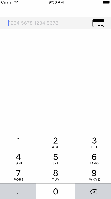
|placeholders | PropTypes.object | Defaults to { number: "1234 5678 1234 5678", expiry: "MM/YY", cvc: "CVC" } |
|inputStyle | Text.propTypes.style | Style for credit-card form's textInput |
|validColor | PropTypes.string | Color that will be applied for valid text input. Defaults to: "{inputStyle.color}" |
|invalidColor | PropTypes.string | Color that will be applied for invalid text input. Defaults to: "red" |
|placeholderColor | PropTypes.string | Color that will be applied for text input placeholder. Defaults to: "gray" |
| additionalInputsProps | PropTypes.objectOf(TextInput.propTypes) | An object with Each key of the object corresponding to the name of the field. Allows you to change all props documented in RN TextInput.
LiteCreditCardInput does not support requiresName, requiresCVC, and requiresPostalCode at the moment, PRs are welcome :party:
| Property | Type | Description |
| --- | --- | --- | --- |
|autoFocus | PropTypes.bool | Automatically focus Card Number field on render|
|onChange | PropTypes.func | Receives a formData object every time the form changes |
|onFocus | PropTypes.func | Receives the name of currently focused field |
|labels | PropTypes.object | Defaults to { number: "CARD NUMBER", expiry: "EXPIRY", cvc: "CVC/CCV" } |
|placeholders | PropTypes.object | Defaults to { number: "1234 5678 1234 5678", expiry: "MM/YY", cvc: "CVC" } |
|cardScale | PropTypes.number | Scales the credit-card view.
Defaults to 1, which translates to { width: 300, height: 190 } |
|cardFontFamily | PropTypes.string | Font family for the CreditCardView, works best with monospace fonts. Defaults to Courier (iOS) or monospace (android) |
|cardImageFront | PropTypes.number | Image for the credit-card view e.g. require("./card.png") |
|cardImageBack | PropTypes.number | Image for the credit-card view e.g. require("./card.png") |
|labelStyle | Text.propTypes.style | Style for credit-card form's labels |
|inputStyle | Text.propTypes.style | Style for credit-card form's textInput |
|inputContainerStyle | View.propTypes.style | Style for textInput's container
Defaults to: { borderBottomWidth: 1, borderBottomColor: "black" } |
|validColor | PropTypes.string | Color that will be applied for valid text input. Defaults to: "{inputStyle.color}" |
|invalidColor | PropTypes.string | Color that will be applied for invalid text input. Defaults to: "red" |
|placeholderColor | PropTypes.string | Color that will be applied for text input placeholder. Defaults to: "gray" |
|requiresName | PropTypes.bool | Shows cardholder's name field
Default to false |
|requiresCVC | PropTypes.bool | Shows CVC field
Default to true |
|requiresPostalCode | PropTypes.bool | Shows postalCode field
Default to false |
|validatePostalCode | PropTypes.func | Function to validate postalCode, expects incomplete, valid, or invalid as return values|
|allowScroll | PropTypes.bool | enables horizontal scrolling on CreditCardInput
Defaults to false |
|cardBrandIcons | PropTypes.object | brand icons for CardView. see ./src/Icons.js for details |
| additionalInputsProps | PropTypes.objectOf(TextInput.propTypes) | An object with Each key of the object corresponding to the name of the field. Allows you to change all props documented in RN TextInput.
##CardView
| Property | Type | Description |
| --- | --- | --- | --- |
|focused | PropTypes.string | Determines the front face of the card|
|brand | PropTypes.string | Brand of the credit card|
|name | PropTypes.string | Cardholder's name (Use empty string if you need to hide the placeholder) |
|number | PropTypes.string | Credit card number (you'll need to the formatting yourself) |
|expiry | PropTypes.string | Credit card expiry (should be in MM/YY format)|
|cvc | PropTypes.string | Credit card CVC |
|placeholder | PropTypes.object | Placeholder texts|
|scale | PropTypes.number | Scales the card|
|fontFamily | PropTypes.string | Defaults to Courier and monospace in iOS and Android respectively|
|imageFront | PropTypes.number | Image for the credit-card |
|imageBack | PropTypes.number | Image for the credit-card |
|customIcons | PropTypes.object | brand icons for CardView. see ./src/Icons.js for details |
additionalInputsProps gives you more control over the inputs in LiteCreditCardInput and CreditCardInput. An example object is as follows:
addtionalInputProps = {
  name: {
    defaultValue: 'my name',
    maxLength: 40,
  },
  postalCode: {
    returnKeyType: 'go',
  },
};
The above would set the default value of the name field to my name and limit the input to a maximum of 40 character. In addition, it would set the returnKeyType of the postalcode field to go.
Set values into credit card form
	// sets 4242 on credit card number field
	// other fields will stay unchanged
	this.refs.CCInput.setValues({ number: "4242" });
Known issues: clearing a field e.g. setValues({ expiry: "" }) will trigger the logic to move to previous field and trigger other kind of weird side effects. PR plz
focus on to specified field
	// focus to expiry field
this.refs.CCInput.focus("expiry");In the example directory, run:
npm install

react-native run-ios
# or
react-native run-android- Open a GitHub issue, or
- Send a pull request :D
- Make sure
npm run lintpassed
- Add unit tests
- Create example with react-native-awesome-card-io
cardViewSizeprop are removed fromCreditCardInput, usecardScaleinstead (because changing the size will break most of the texts)bgColorprop are removed fromCreditCardInput, ask your designer friend to make a credit card image instead (or use the prebundled image)imageFrontandimageBackprops are renamed tocardImageFrontandcardImageBackrespectively,- Android
monospacefonts doesn't looks as nice as iOSCourier, bundle custom fonts into your app and override the default usingcardFontFamilyinstead