SwiftWidgets is a UIKit widget framework focused on speed of development, reusability and composability.
SwiftUI is the future (and pretty awesome), but for those of us who still have to support iOS 12 (and 11, and sometimes even 10), it's going to take a couple of years before we can use it in production. SwiftWidgets is an attempt to simplify UIKit development using reusable and composable view containers (widgets). Widgets primarily live in in a table view (WidgetTableViewController), but you can easily embed them inside stack views, scroll views, other widgets, or just plain old UIViews.
CocoaPods is a dependency manager for Cocoa projects. You can install it with the following command:
$ gem install cocoapodsTo integrate SwiftWidgets into your Xcode project using CocoaPods, specify it in your Podfile:
source 'https://github.com/CocoaPods/Specs.git'
platform :ios, '10.0'
use_frameworks!

target '<Your Target Name>' do
    pod 'SwiftWidgets'
end
Then, run the following command:
$ pod install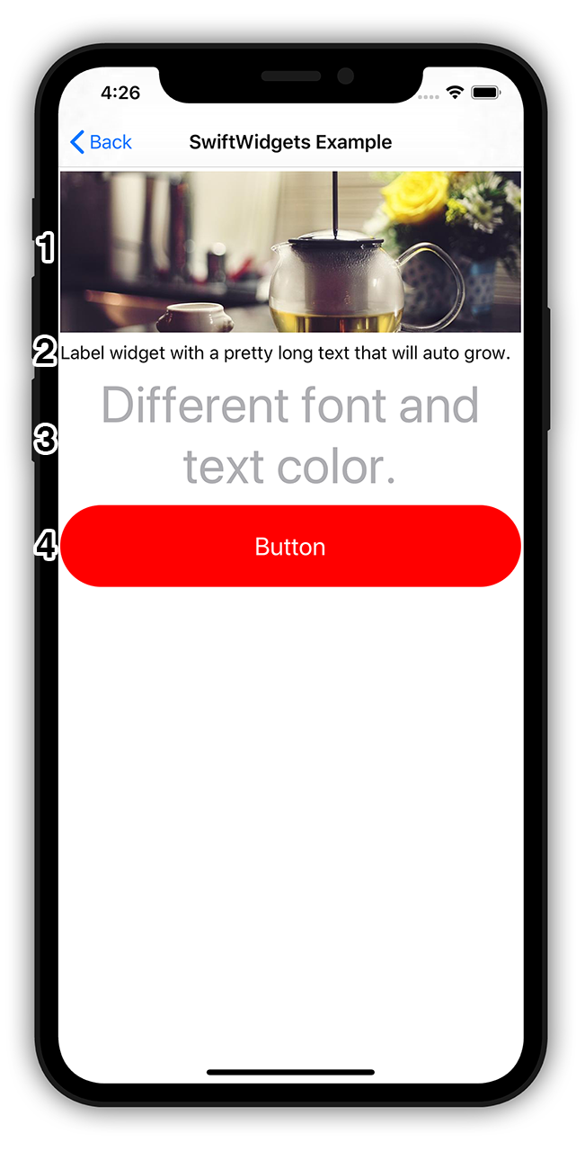
import SwiftWidgets

class QuickstartExample: WidgetTableViewController {
    override func viewDidLoad() {
        super.viewDidLoad()

        addWidget(ImageWidget.self) { // 1
            $0.image.image = 🏙
            $0.height = 150
        }

        addReusableWidget(LabelWidget.self) { // 2
            $0.text.text = "Label widget with a pretty long text that will auto grow."
        }

        addReusableWidget(LabelWidget.self) { // 3
            $0.text.text = "Different font and text color."
            $0.text.font = Settings.Font.with(size: 45)
            $0.text.color = Settings.Color.darkGray
            $0.text.alignment = .center
            $0.tap = { widgetInstance in
                print("Text tapped - widget", widgetInstance)
            }
        }

        addWidget(ButtonWidget.self) { // 4
            $0.text.text = "Button"
            $0.text.font = Settings.Font.title
            $0.text.color = .white
            $0.padding.vertical = Settings.Offset.basic
            $0.cornerRadius = 1.0
            $0.buttonColor = Settings.Color.primary
            $0.height = 80
            $0.click = {
                print("button click")
            }
        }
    }
}
A short explanation:
- Add a new image widget to the table view. Use the closure to set the image source to a
UIImageand set the widget height to150. - Add a reusable label widget (widget views are reused via
tableView.dequeueReusableCelland re-initialized using a new model instance). - Add a label widget, set the text content, font, color and aligment, and setup a tap handler callback.
- Add a button widget with custom text, corner radius, vertical padding, and click callback. The button can be disabled, so it's preferable to use the
clickcallback instead of the usualtapto prevent getting events in a disabled state.
In the following sections we'll talk about the widget anatomy and lifecycle, settings, making your own widgets and more.
Widgets are composed of a view (inherited from Widget) and a model (inherited from WidgetModel). To make your own widgets, just implement a pair of view - model and set typealias Model to the model class name. The WidgetInstantiable protocol will take care of the rest.
class CustomWidget: Widget, WidgetInstantiable {
    typealias Model = CustomWidgetModel

    @IBOutlet weak var mainLabel: UILabel!
    @IBOutlet weak var imageView: UIImageView!
    @IBOutlet weak var spacingConstraint: NSLayoutConstraint!

    public let imageComp = ImageComponent()

    override func load() {
        super.load()

        spacingConstraint.constant = CGFloat(model.titleImageSpacing)
        imageComp.setup(target: imageView, model: model.image, widgetModel: model)
        LabelComponent().setup(target: mainLabel, model: model.text, widgetModel: model)
    }
}

class CustomWidgetModel: WidgetModel {
    var image = ImageComponentModel()
    var text = LabelComponentModel()
    var titleImageSpacing: Float = 20

    // override defaults
    override func afterInit() {
        text.alignment = .center
        height = 300
    }
}SwiftWidgets use the standard margin - padding - content layout model:

Margin insets are set using $0.margin.left, $0.margin.right, $0.margin.top and $0.margin.bottom, as well as convenience properties $0.margin.horizontal for left & right, $0.margin.vertical for top & bottom, and $0.margin.all for all 4. The background color of the main view is set with $0.color.background.
Padding insets are set similarly with $0.padding.left etc, and padding view background is set with $0.color.padding
The main content view is added with the addContentView() method or automatically selected as the first subview of the root view in a xib file. Its background color is set with $0.color.content.

Widgets can have an optional separator (a horizontal line at the bottom) that is customized using $0.separator.XXX:
open class SeparatorModel {
    public var enabled: Bool // is separator shown or not?
    public var height: Float // height of the separator
    public var color: UIColor // separator color
    public var rightPadding: Float // right padding
    public var leftPadding: Float // left padding
}
You can also set up an accessory view ($0.accessory.type) using predefined types (.disclosureIndicator, .activityIndicator, .checkmark) as well as by providing an image ($0.accessory.image) or a view ($0.accesory.view). Other customizable properties include $0.accessory.size, $0.accessory.rightPadding, and $0.accessory.color.
By default, widgets have an intrinsic size defined by their inner constraints (such as LabelWidgets that grow with their content text). However, you can also explicitly define their height by setting $0.height = 150. This often happens when you want all widgets in a table to have a fixed size.
On init the widget model is populated with default values. The default values are set up by calling
Settings.initDefaults(Config())where Config implements the protocol SettingsConfig.
You can also get the default values directly, for example here we set the label up with a default title font, primary color and 2* the usual padding:
addReusableWidget(LabelWidget.self) {
    $0.text.text = "Use default settings"
    $0.text.font = Settings.Font.title // we could also use an explicit font size: Settings.Font.with(size: 25)
    $0.text.color = Settings.Color.primary
    $0.padding.all = Settings.Offset.basic2 // .basic = N, basic2 = 2*N, basic4 = 4*N etc.
}
For more default values please look up the SettingsConfig protocol, as well as SettingsOffset (Settings.Offset.XXX), SettingsColor (Settings.Color.XXX), and SettingsFont (Settings.Font.XXX).
You can use different configs to easily skin your widgets as long as you only use the Settings properties to set the widgets up.

Widget views are either built in code (by overriding the build() method), or instantiated from a xib with the same name as the widget view. In the case of CustomWidget from Widget Anatomy, the widget is defined in CustomWidget.xib and CustomWidget.swift. If a xib hadn't been used, the widget view would have to implement the build() method instead:
public lazy var mainContent: UITextField = {
    let view = UITextField()
    return view
}()

public override func build() {
    addContentView(mainContent)
}
build() is called only once in the lifecycle, so use it to create all the necessary views, layout them using constraints and set the root view using addContentView. addContentView takes care of setting up the views and constraints needed to manage the basic layout (paddings, margins etc.)
After building the widget view, a model is added and the widget is set up using data from the model in load(). If you plan to reuse widgets in a table view (addReusableWidget), you'll need to handle load() being called multiple times during the lifecycle of the view with different models. This may necessitate some cleanup if your widget maintains state. If you don't plan to reuse your widgets, only a single load() with a single model occurs in the lifecycle of the view.
Widgets in a WidgetTableViewController are embedded in a table view cell (WidgetTableViewCell). You can make changes to the cell in attachedToCell():
override func attachedToCell() {
    parentCell?.isUserInteractionEnabled = true
}When reusing the view, a new model is added, and load() and attachedToCell() are called again. After that the view is ready to be used again.
There are several built-in containers that display and layout widgets (listed below). If you require something more specific, you can easily write your own by implementing the WidgetContainer protocol. The protocol defines common methods such as addWidget, so little effort is required when displaying widgets in a different container (mostly setting up the container).
WidgetTableViewController is the default container used to to display widgets. It automatically displays the widgets in a table view and takes care of scrolling, reusing widgets etc.

VerticalWidgetViewContainer renders widgets in a plain UIView from top to bottom with no scrolling and widget reusing. A typical use case is anchoring the container to the bottom of the window and showing a widget or two over the rest of the screen content.
VContainerWidget renders widgets inside of a widget vertically. It's more or less just a VerticalWidgetViewContainer encapsulated inside a widget.
HorizontalScrollContainerWidget renders widgets inside a horizontal scroll bar. The widget widths are fixed.

HContainerWidget renders widgets horizontally with different alignment options.

You can easily embed a widget in a UIView like this:
let maker = WidgetCreator()
let button = maker.getWidget(ButtonWidget.self) {
    $0.text.text = "Button"
}
button.embedIn(parentView)
A lot of widgets primarily display images and text and are laid out in horizontal and vertical stacks. SwiftWidgets provide a number of components used to define and display texts and images in a standarized manner, as well as utility classes to layout the views.
Let's have a look at a widget that shows an actor with their profile picture, name and character name:

class ActorWidget: Widget, WidgetInstantiable {
    typealias Model = ActorWidgetModel

    let content = HViewContainer()
    let vertical = VViewContainer()
    let nameLabel = UILabel()
    let characterLabel = UILabel()
    let imageView = UIImageView()

    public let imageComp = ImageComponent()

    override func build() {
        vertical.views = [nameLabel, characterLabel] // 3
        vertical.verticalAlignment = .center
        content.views = [imageView, vertical] // 4
        content.verticalAlignment = .center

        addContentView(content) // 5
    }

    override func load() {
        super.load()

        content.spacing = Settings.Offset.basic
        vertical.spacing = Settings.Offset.basic

        content.layoutContent() // 6
        vertical.layoutContent()

        imageView.snp.makeConstraints {
            $0.size.equalTo(60) // 7
        }

        LabelComponent().setup(target: nameLabel, model: model.name, widgetModel: model) // 8
        LabelComponent().setup(target: characterLabel, model: model.character, widgetModel: model)
        imageComp.setup(target: imageView, model: model.image, widgetModel: model)
    }
}

class ActorWidgetModel: WidgetModel {
    public var name = LabelComponentModel() // 1
    public var character = LabelComponentModel()
    public var image = ImageComponentModel() // 2

    override func afterInit() {
        image.setup = { image in
            image.layer.cornerRadius = 30
            image.clipsToBounds = true
        }
    }
}LabelComponentModelcustomizes the text/htmlText/attributedText, font, color, alignment and numberOfLines of a labelImageComponentModelcustomizes the image/imageUrl, contentMode, placeholder image, error image, activityIndicator, and tintColor of an image view- Set up a vertical container containing the actor name and character labels centered vertically
- Set up a horizontal container containing the actor profile image view and the vertical container from the previous step
- Set the horizontal container as the widget's content view
- Layout the subviews inside the vertical and horizontal container
- During the previous steps the constraints on subviews were overwritten, so we need to set the image view's dimensions
- Set up the labels and image view components from model data
Then you just add the widget and set it up. You can easily make variants of the widget by specifying a different font, color etc.:
protocol WidgetMaker: WidgetContainer {
}

extension WidgetMaker {
    func addActor(_ actor: MovieCastViewModel) {
        addWidget(ActorWidget.self) {
            $0.image.imageUrl = URL(string: imageUrl)
            $0.image.contentMode = .scaleAspectFill

            $0.name.text = actor.name
            $0.name.font = Settings.Font.with(size: 18, weight: .semibold)
            $0.character.text = actor.character
            $0.character.font = Settings.Font.with(size: 14)
            $0.character.color = Settings.Color.darkGray
            $0.padding.vertical = Settings.Offset.basic2
            $0.padding.horizontal = Settings.Offset.basic2

            $0.accessory.type = .disclosureIndicator
            $0.separator.enabled = true
        }
    }
}SwiftWidgets is still in beta and the core interfaces are subject to change. PRs are welcome!
SwiftWidgets is released under the MIT license. See LICENSE for details.